SharePoint is a wonderful option for organizations to host their intranet. In most cases marketing or communication is heavily involved in the process of building and configuring the intranet. One of their main points of concern is to import the company brand or company identity in the new platform. During the good ol’ days of unlimited spending for IT-departments a sizable chunk of the budget was allocated to this very issue: making sure that SharePoint doesn’t look like SharePoint anymore.
That complete overhaul of a SharePoint UI was a costly matter, not only during the development-stages but also whenever the system had to be upgraded. With this in mind, the more compact budgets and the transition to the cloud (with less customization options) we have noticed an extreme reaction in the opposite direction. Most IT-departments don’t bother with heavy customizations to the SharePoint interface anymore, because… well basically because it’s just too expensive.
But that doesn’t mean that every SharePoint-based intranet looks the same, on the contrary. There are plenty of out of the box options for SharePoint admins to carry the company identity.
What makes a corporate identity in SharePoint?
Microsoft conducted a study into company branding. Results showed that there are four main contributing factors to the name recognition of a brand online:
- Logos
- Navigation
- Colour scheme & fonts
- Content structure
The results also showed that the features offered by the modern interface on SharePoint online were too limited. More customizations were necessary to give users the feeling they were working on a company platform. And thus, Microsoft went to work…
Colour schemes & fonts
When it comes to the visuals, SharePoint allows admins to create themes. Themes are comprised of colour schemes and font schemes. Now in the classic layout of SharePoint site owners were able to mix and match pre-installed colour schemes and fonts to create their own theme. This option still exists today! Unfortunately as soon as you deploy the new lay-out, you’ll see the modern SharePoint side revert to the options that are a part of the modern experience. The classic side, for example the site settings, will have the options you chose. Your site now has a modern theme for the modern side and a classic theme for the classic side.
When we take a look at the options available to us through the modern interface we can see that we can choose from eight themes with lighter colours and two with a dark background. When you pick a theme you can customize a bit further by picking different accent colours but that is basically it. Microsoft removed the option to select any other than the default Segoe UI font, so for the time being that is all we get.
Now what if, and this scenario is more than likely, your company’s colours aren’t in the predefined themes? There is a way, but unfortunately it involves some PowerShell. This blog isn’t supposed to be a technical guide on how to upload custom themes, but we’ll happily refer you to both the theme generator (Fluent UI Theme Designer (windows.net)) and the PowerShell-script (Add-SPOTheme (Microsoft.Online.SharePoint.PowerShell) | Microsoft Learn) to do so.
Logos
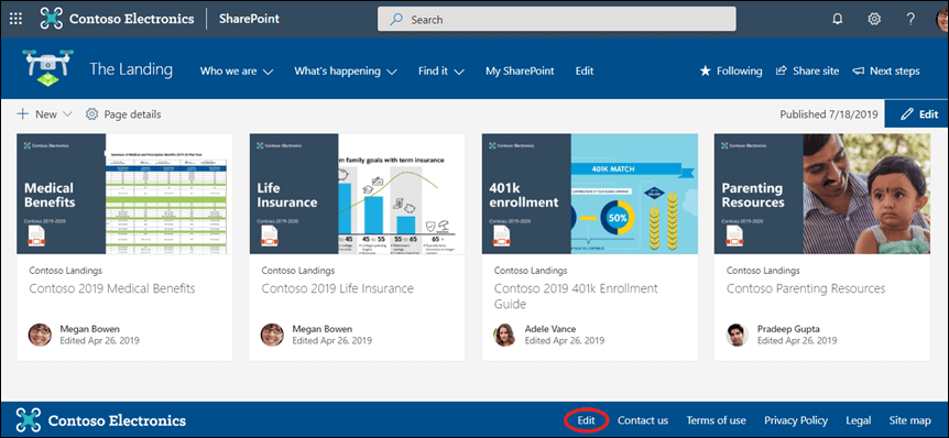
SharePoint logos can be uploaded in the look and feel part of the website. You can upload a site logo, that will appear on the top left of your site in the heading next to the name of your site, and a logo thumbnail which will appear as thumbnails on the cards on the SharePoint start page.
The heading of a website is customizable as well, you can choose the size and colour of the site header from one of your four theme colours. Not good enough? Try switching to the extended header layout. Now you get the extra option to add a background image rather than a background colour.
As you may know there are two commonly used site templates, Team Sites and Communication Sites. Even though they are very similar, communication sites offer a couple of extra options to customize your site. One such feature is the ability to add a footer to your site. This footer contains another container for you to store a logo in.

Navigation
Traditionally users could find the navigation in SharePoint sites on the left side. Nowadays site creators have a choice, they can either choose to go for a traditional look with the navigation to the left or they can choose to display the navigation in the header. This in turn unlocks another choice, the navigation in the header can be displayed in the header in two ways: cascading, with multiple tiers of dropdown lists or in a megamenu that naturally groups links in a couple of large panels.
The footer area we talked about before offers companies yet another location to provide users with links, this is usually reserved for disclaimers and links to the company’s socials.

Content structure
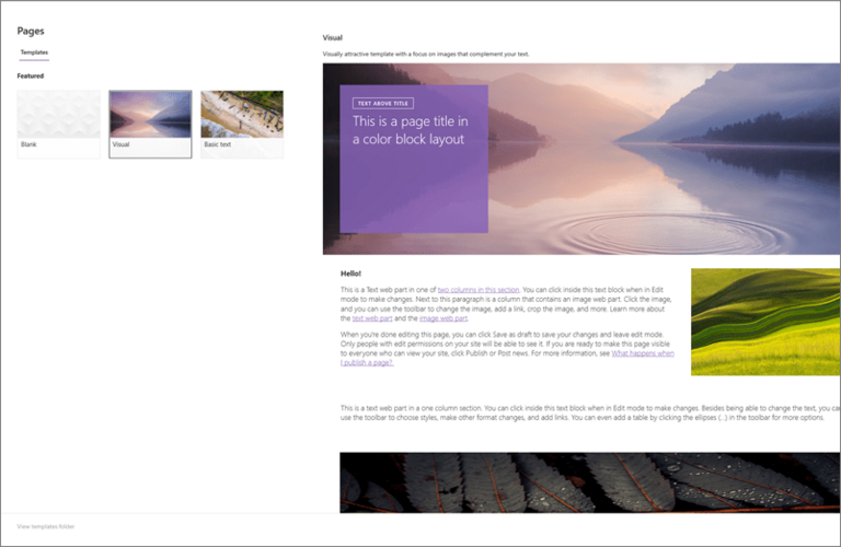
And finally we can talk about some content. In SharePoint we can create page templates ensuring that specific information is always found in the same location on all pages. This creates recognition for users and helps them navigate through the intranet. This way content creators can focus on their actual content rather than on how their content looks.

Conclusion
SharePoint has come a long way since switching to the modern experience. When the modern layout first launched the options were… limited at best. And while some old school SharePoint admins might miss the days of spending big on the design of their SharePoint pages, even they have to admit that these days SharePoint offers a great deal features to foster the brand identity of the company. We can only hope Microsoft continues this trend of improving and expanding on features the community wants. I mean who wouldn’t like an intranet with a Comic Sans font?


